线图-范文01
1. 根据线性图写报告(20分钟)
The line graph below shows the birth and death rates per thousand population. Write a report describing the information shown below. You should write at least 150 words.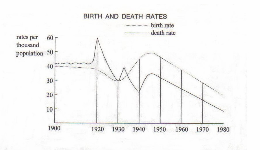
第一段,用一句话解释这个图是干嘛的。
第二段,
1.按照时间段描述第一条线的走势。
2.描述最高最低点。
3.第二条线的走势。
4.两条线的关系。
总结:得出一句话结论
This graph shows the birth and death rates per thousand population from 1900 to 1980.
Before 1920 the birth rate remained..
Then from 1920 it fell until it reached 30 per thousand in 1930.
From 1930 to 1945 it rose slowly (increased steadily) to 50 per thousand. Since 1945 it had decreased/fallen steadily. It got to 20 per thousand in 1980. The birth control measures were becoming effective and the birth rate was falling/decreasing at the moment and would continue to fall.
On the other hand, between 1900 and 1918 the death rate stayed constant at 41 per thousand. In 1918, however, it rose sharply and reached the peak of 60 per thousand in 1920. From 1920 to 1930 the death rate fell. It reached the same point of 30 per thousand as the birth rate in 1930. There was a rapid increase in 1930 and also in 1940. Since 1945 it had fallen steadily and arrived at 10 per thousand in 1980.
This is very similar to the case of the birth rate.
结论 The improvement of people’s living conditions and medical care resulted in the fall of the death rate.